Devlog 3: Final Prototype & refined Art-style
Introduction
Since the last Devlog and our decision to use Unity over Unreal, we have progressed towards refining the gameplay and controls of the main character, which Lars has also started to design and block out.
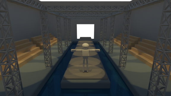
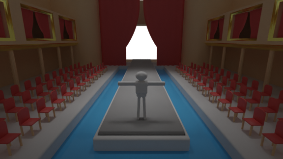
To get a more realistic feel for what our game might look like Gabriele made two blockouts of the level our game is going to be set in, a TV show and an opera house (we might add more in the future)
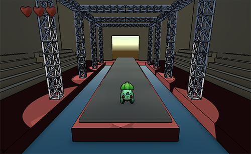
Moreover we implemented the first version of the lit cel shader we're going to use, to achieve the look we defined in Devlog 01, together with an outline post-process effect based on a Sobel filter running on the normal pass, and colour contrast differences in the scene.
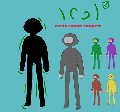
Although we can't wait to start modelling more definitive and detailed assets first we had to define a good starting point for our design rules and shapes. That's what Lars did by expanding and completing the Artbible which will be our "safety net" and overall guide in the following weeks of work.
We added more definitive walls with silhouettes the players have to match. Two sets of walls exist at the moment an easier type of wall and a more challenging version which will be spawned more frequently as the gameplay progresses.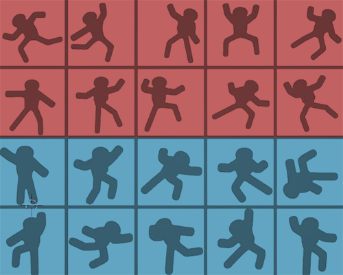
In our latest development update, we successfully integrated the newly designed rig into our prototype, ensuring that the pivot point is correctly aligned. This rig enhances the gaming experience by imbuing it with a more authentic, human-like feel.
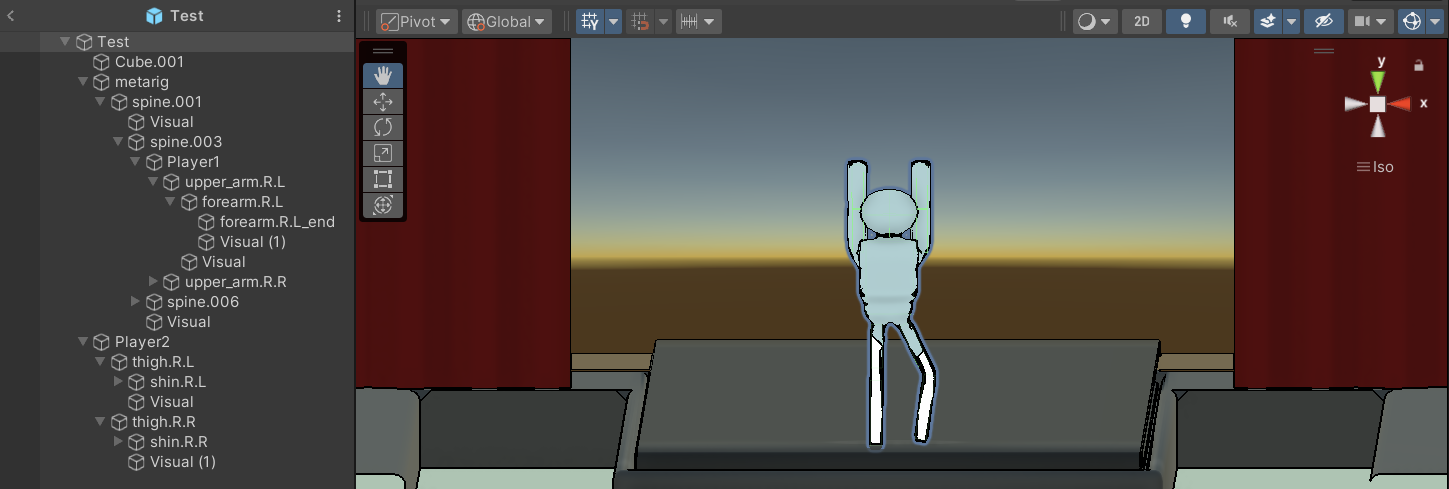
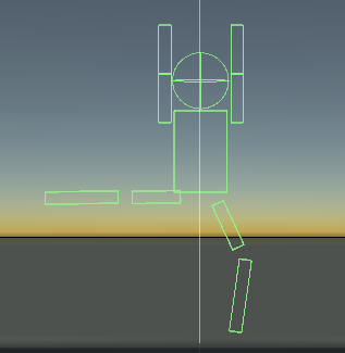
To complement this new rig, we implemented a revamped collision system. After experimenting with various approaches, we settled on employing basic box colliders affixed to the pivot point. This choice was made to optimize performance and ensure technical compatibility.
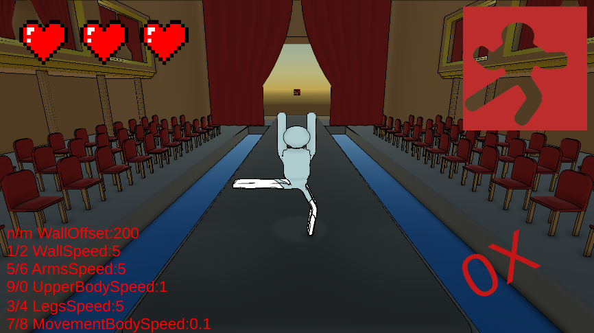
In response to user feedback and gameplay observations, we made several adjustments. Firstly, we replaced the textual lives indicator with intuitive UI hearts. This change reduces distractions and provides a clearer representation of the remaining lives.
Additionally, we introduced a UI element that constantly displays incoming silhouettes, aiding players in anticipating the next pose required to navigate incoming obstacles effectively.
As a further gameplay enhancement, we introduced a simple combo mechanic. Upon reaching a specified threshold, players are rewarded with an extra life. This element will be expanded upon in the future!
Files
Get Form Frenzy
Form Frenzy
Dodge, Weave, and Strike a Pose in this High-Octane Puzzle Adventure!
More posts
- Devlog: 1.0 ReleaseMay 26, 2024
- Devlog 9: Polish SprintMay 22, 2024
- Devlog8: Production Sprint 2 3May 15, 2024
- Devlog7: Production Sprint 2 2May 08, 2024
- Devlog7: Production Sprint 2 1May 02, 2024
- Devlog 6: Production Sprint 1Apr 25, 2024
- Devlog 5: Production sprint 1Apr 18, 2024
- Devlog 4: Production sprint 1Mar 27, 2024
- Devlog 2: Pre-Production & PrototypingMar 14, 2024
Leave a comment
Log in with itch.io to leave a comment.